The 1970s were a strange time, to put it mildly.
Chicken farmers gassed, drowned, and suffocated roughly a million baby chicks. “It’s cheaper to drown ’em than to put ’em down and raise ’em,” one Texas farmer explained. Dairy farmers slaughtered cows. Hog farmers culled breeding stock.
Why did any of this happen? Good old price controls.
This isn’t another “price controls are bad” post. (They are.) But a new paper of mine with Alex Tabarrok and Mark Whitmeyer adds something genuinely new: a theorem explaining why price controls generate exactly this kind of “chaos,” as we call it, and a new way to measure the costs without assuming a demand curve.
Most people, of course, think first about gasoline lines associated with 1970s price controls. I’ve written before about the 1970s gas crisis—odd-even rationing, fights at filling stations, and lines that vanished almost overnight when controls ended. In Maryland and Connecticut, lines stretched for miles. More than 90% of stations in Connecticut and Massachusetts rationed fuel. Some ran out entirely.
What gets less attention is the other side. In Idaho, Montana, Utah, and Wyoming, not a single surveyed station reported any problem, according to AAA survey data presented to President Ford during the crisis. Zero. Texas, the Deep South, and the Great Plains were, as Time magazine put it, “virtually awash with gasoline.”
So why would a 9% national gasoline shortfall produce more than 90% of stations rationing in Connecticut and no shortages in Idaho?
The answer points to the same mechanism that leads farmers to destroy livestock, rather than gradually scale back output. The key to understanding it, as always, is price theory.
Why Markets Nudge and Controls Lurch
Our paper explains why price controls generate exactly this sort of “chaos.”
Start with how prices normally coordinate markets. Suppose gasoline is more valuable in Connecticut than in Idaho. Under market pricing, a trader can profit by redirecting supply eastward. The higher Connecticut price rises just enough to cover the extra shipping cost. A small cost advantage affects only the marginal tanker loads, because the higher price in the underserved market pushes back.
Here’s what that means in practice. If it costs 1 cent more per gallon to deliver fuel to Connecticut than to Idaho, a supplier may redirect a few tanker loads to capture the gain. But as those loads leave Idaho, the Connecticut price rises and the Idaho price falls. The gap narrows until it equals the cost difference. The system settles on a marginal adjustment—a few tanker loads shift—and both markets remain supplied. Prices discipline arbitrage. They limit how far any reallocation can go.
Now freeze the price everywhere.
Every gallon earns the same revenue regardless of destination. I must sell at 50 cents in Idaho or Connecticut; the government forbids charging more. Where should I ship? The mechanism that normally equalizes markets disappears. Connecticut offers no premium to attract supply. Idaho offers no discount to repel it.
Under market prices, a 1-cent cost advantage produces a marginal reallocation. Under a price ceiling, the same 1-cent advantage redirects the entire flow (abstracting from transaction costs). Because no higher destination price pushes back, a 1-cent advantage works like a $1 advantage. What would have been incremental becomes categorical. As Thomas Sowell argued in “Knowledge and Decisions,” the economy loses its capacity for gradual adjustment and instead jumps between all-or-nothing outcomes.
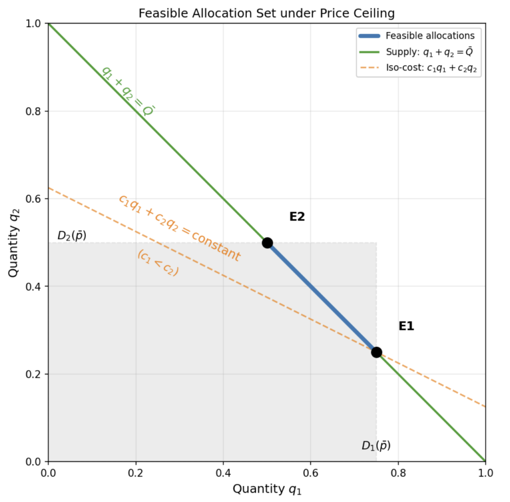
A bit of geometry clarifies the point. The set of feasible allocations—all ways to divide a fixed supply across markets—forms a shape with sharp corners. With market pricing, the objective (maximizing consumer surplus) is curved, so the optimum lies in the interior. With price controls, the supplier minimizes cost, and cost is linear in quantity. A linear objective over a shape with corners always lands on a corner. Some markets receive full supply. Others get nothing. No “split the difference” outcome exists.
The figure below illustrates the logic. The blue segment shows all feasible splits of a fixed supply between two markets. Its endpoints are E1 (Market 1 filled first, Market 2 receives the residual) and E2 (the reverse). The dashed orange lines represent the supplier’s cost curves; because cost is linear, they are straight lines. Slide a straight line across a segment and it stops at an endpoint. If serving Market 1 is even slightly cheaper, the solution is E1. If the cost ranking flips by a fraction of a cent, the allocation jumps to E2. There is no gradual movement between them.
The all-or-nothing result follows directly from the incentives that price controls create.
Shortages by Coin Flip
Corner allocations are bad enough. It gets worse: which corner the economy selects is unpredictable.
When two markets have nearly identical delivery costs, the system sits on a knife’s edge. A refinery outage, a pipeline repair, a regulatory tweak—any small shift in relative cost—can flip which market is supplied and which is starved. The allocation jumps discontinuously, even though the parameter change is tiny. We call this the “Chaos Theorem.”
Why “chaos”? Under normal market conditions, small changes produce small effects. If a pipeline shuts down, nearby prices rise a bit, a few tanker loads reroute, and the system settles near its old equilibrium. Prices provide pushback that keeps adjustments gradual. Price controls remove that pushback. Once every gallon earns the same regulated price everywhere, the supplier minimizes cost, and cost is linear in quantity. Linear problems don’t glide; they jump between corners.
Under market pricing, a pipeline repair shifts the last few tanker loads. Under price controls, it can shift all the tanker loads.
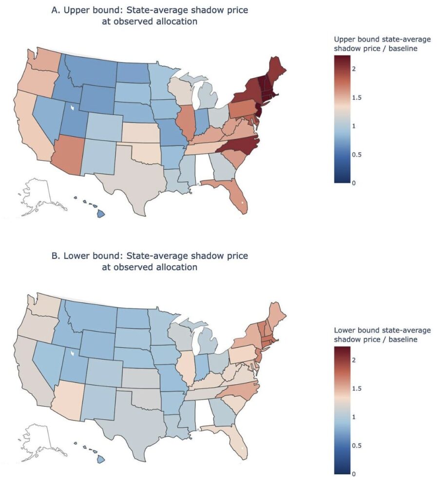
Consider the map again: a dark-red Northeast and a white Mountain West. It’s tempting to say Idaho got lucky and Connecticut got unlucky. But an efficient allocation under a 9% national shortfall would spread the pain—roughly a 9% reduction everywhere, or at least some reduction everywhere. Zero rationing means those states received more than their efficient share. Abundance in some regions signals the problem, not an escape from it. In an efficient allocation, the marginal value of gasoline—what economists call the “shadow price”—would equalize across markets. Some stations would modestly limit purchases. No five-mile lines, and no completely unaffected regions.
This instability arises whenever regulators suppress prices across segmented markets. Our paper proves that, when delivery costs across two destinations are nearly equal, arbitrarily small cost changes can move welfare up or down by a fixed, discrete amount. Allocation becomes hypersensitive to nuisance parameters: transport costs, regulatory discretion, historical consumption patterns, all factors that would be irrelevant under market-clearing prices.
The most vivid illustration appeared in the Soviet Union. Citizens carried avoska bags, from avos’ (“perhaps,” or “just in case”). You brought the bag everywhere because shortages were unpredictable: shoes today, soap tomorrow, nothing next week. People joined queues without knowing what was for sale, because the queue itself signaled temporary availability. Factories “stormed,” alternating between idle periods and frantic bursts near plan deadlines, because input deliveries were erratic and uncoordinated with production schedules. The Chaos Theorem works good by good. Extend it across an entire economy—goods used as inputs into other goods, each with its own ceiling—and corner allocations compound across production stages. Communism is universal price controls. The avoska bag shows what life looks like when allocation depends on which pipeline happens to be under repair.
As I discussed in “People Act, Markets Clear,” markets always clear one way or another. Under price controls, they clear through queues, quality cuts, and rationing schemes. The Chaos Theorem adds a further point: which market gets rationed is itself unstable.
The Harberger Triangle’s Evil Twin
If price controls push allocation to corners, the next question is obvious: what does that cost?
To answer it, we need the idea of a “shadow price”—what consumers would actually pay for one more gallon if they could. With efficient allocation, shadow prices equalize: the last gallon is worth about the same to a driver in Connecticut as to one in Montana. The familiar Harberger triangle assumes this equalization. It measures the cost of having less total supply, while taking for granted that the reduced supply still goes to the right places. That’s the best case. The real cost, driven by misallocation, was several times larger.
The map makes the misallocation visible. Idaho had zero shortages and received more than its efficient share—even more than its uncontrolled amount—at Connecticut’s expense.
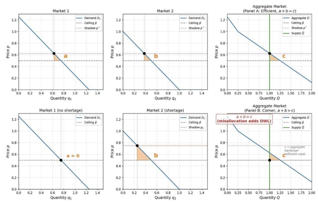
The top row of the figure shows the textbook case: shadow prices equalize across markets, and the welfare loss is the standard Harberger triangle. The second row shows what happens when cost minimization determines allocation. One market gets everything it wants at the controlled price; the other gets the residual. The welfare loss in Panel B is nearly an order of magnitude larger than in Panel A. Same total supply. Same controlled price. Only the distribution differs.
As Josh Hendrickson has emphasized, competition for scarce goods doesn’t disappear under price controls. It changes form—queues, quality degradation, black markets. Our paper identifies an additional mechanism: the allocation itself breaks down, even before accounting for waiting or quality cuts. Distribution across markets runs to extremes because the same cost minimization that normally disciplines prices no longer faces price variation.
States with zero rationing signal misallocation, not relief from shortage.
At the artificially low controlled price, a homeowner in Idaho might burn cheap gas heating a swimming pool, while a commuter in Connecticut can’t get enough fuel to drive to work. At market prices, the commuter’s willingness to pay would outbid the pool heater, and supply would flow east. Under a binding ceiling, both pay the same price. No mechanism remains to redirect supply. Rationing in Connecticut and abundance in Idaho are two sides of the same misallocation.
We Brought a Triangle to a Chaos Fight
Every intermediate microeconomics textbook draws the Harberger triangle as the cost of a price ceiling. Quantity falls, the triangle measures the deadweight loss, and the lecture moves on. That analysis is correct as far as it goes. It assumes the reduced supply is still allocated efficiently across markets, with shadow prices equalized. That’s the best case.
For the 1973-74 gasoline crisis, the Harberger triangle is about 2% of baseline consumer spending on gasoline—the cost of having 9% less fuel, assuming the remaining fuel goes to the right places.
It didn’t.
Using station-level AAA survey data presented to President Ford during the crisis, we find exactly the corner-solution structure predicted by the Chaos Theorem: 62.3% of stations operated normally, 27.6% limited purchases, and 10.1% ran out of fuel entirely. Open stations satisfied customers at the controlled price. Closed and limiting stations received the residual.
Measuring the welfare cost of that misallocation raises a problem. Normally, you need a demand curve to compute welfare losses—what consumers would have paid at different prices. Price controls destroy precisely that information. When every transaction occurs at the same regulated price, observed behavior reveals almost nothing about marginal valuations. The standard method—assume a demand curve and compute surplus loss—quietly imports the knowledge that price suppression eliminates.
Elasticity estimates identify demand near equilibrium. But rationed stations received only 68% of baseline quantity, and many received none at all. We are nowhere near equilibrium. Extrapolating a demand curve from equilibrium estimates to these depressed quantities means the answer depends entirely on the assumed functional form. Change the elasticity and you can produce almost any number.
We therefore developed a new bounding approach. Instead of assuming a demand curve and producing a single estimate, we ask: across all demand curves consistent with what we can observe—the allocation data, the ceiling price, and plausible ranges of consumer responsiveness—what are the largest and smallest welfare losses? The result is a robust interval, not a fragile point estimate.
Partial identification—bounding what the data can reveal without committing to a functional form—is well established in econometrics. Our contribution shows how a complicated many-state, many-station problem collapses into a much simpler one using a basic economic idea: the quantities must add up across markets.
What demand curves would generate the greatest possible loss consistent with observed behavior? Consider a station that ended up with ample fuel—“open.” The worst case is that, under efficient allocation, those stations should have received very little. The gap between what they got and what they should have gotten becomes as large as possible. For the lower bound, we reverse the logic and select admissible shapes that compress those gaps.
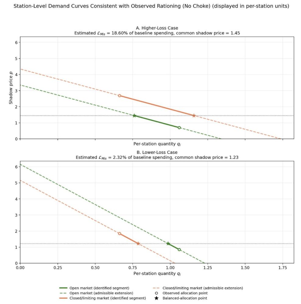
The real novelty in the multi-market case is the adding-up restriction. Total quantity is fixed, so what one market gets, another must lose. That accounting identity links markets through a common shadow price and collapses what looks like a high-dimensional demand-shape problem into a one-dimensional search.
The nerds can check the math.
From that bounding exercise we recover shadow prices, and they tell a clear story. In the upper-bound case—the configuration that maximizes welfare loss across admissible demand curves—Connecticut’s state-average shadow price was 2.5 times the precrisis price. Montana’s was 0.7 times baseline. Connecticut consumers valued gasoline at 3.5 times what Montana consumers paid. Shipping a barrel from Montana to Connecticut would have more than tripled your money. Price controls created that arbitrage opportunity and simultaneously blocked anyone from exploiting it. Even in the lower-bound case, the geographic dispersion persists. The pattern is the same, just less extreme—and still substantial misallocation.
The geography is striking. The Northeast, with dense populations and commuter dependence on gasoline, shows the highest shadow prices. The Mountain West, with sparse populations and proximity to refineries, shows the lowest. Under market pricing, that gap would pull supply east until shadow prices converged. Under a ceiling, the gap persists because no one can profit from closing it. The queuing documented by Robert T. Deacon and Jon Sonstelie—hourlong waits at hard-hit stations—matches those shadow-price levels: when the money price can’t rise, the time price does.
The misallocation loss is 1 to 9 times the Harberger triangle. That range is not a confidence interval. It is the full set of welfare losses, consistent with the observed allocation data and our transparent assumptions about demand slopes. The data can’t narrow it further without imposing a specific demand curve—the step we deliberately avoid.
Even at the conservative lower bound, misallocation roughly equals the quantity-reduction loss. The total cost is at least double the textbook estimate. At the upper bound, the Harberger triangle accounts for barely one-tenth of total welfare cost.
Misallocation dwarfs the quantity reduction. The real cost of price controls is where the goods go; the lost quantity is almost beside the point.
Controls All the Way Down
Faced with shortage chaos, the political system moved toward direct quantity management. That response is predictable. When “the market” appears to deliver feast-or-famine outcomes, officials step in to allocate supply themselves. That is exactly what happened.
The Emergency Petroleum Allocation Act of 1973 ratified Nixon’s earlier executive orders, combining legislated price ceilings with an allocation system based pro rata on 1972 consumption. If total supply fell to 90% of 1972 levels, each buyer received 90% of its 1972 allocation. Regulators then layered on exceptions—national defense, essential services, agriculture, independent refiners—under a “fair and equitable” standard.
By 1979, a national quantity reduction of only about 3.5% led, at its peak, to the closure of nearly every gasoline station in New Jersey, Connecticut, and New York City. The Department of Energy threatened yield regulations requiring refiners to produce specified shares of heating oil per barrel of crude and instructed them how much inventory to accumulate ahead of summer gasoline demand.
Price controls metastasize into quantity controls. But quantity mandates do not escape the Chaos Theorem. Allocations are fragile because small parameter errors flip outcomes between corners. Regulators confront the same problem prices normally solve: which markets need more, which need less, and how those answers should change as conditions shift. Without price signals, regulators fly blind. The 1972 baseline already misfired by 1974—population moved, driving patterns changed, and the benchmark no longer resembled efficient allocation.
As I wrote recently in the Washington Post, the new enthusiasm for price ceilings crosses party lines. Donald Trump has proposed capping credit-card interest rates at 10%. Sens. Bernie Sanders and Josh Hawley have introduced legislation to do the same. New York City’s mayor ran on freezing rents for 2 million residents.
When someone proposes a ceiling on groceries, gasoline, rent, or anything else, the instinct is to draw the Harberger triangle and debate its size. The triangle is the least of it. Price controls suppress the mechanism that prevents chaos, and the resulting chaos invites still more control, creating an escalating cycle the price system would have prevented from starting.
Remember the baby chicks. Remember Connecticut and Idaho. A million chicks drowned. More than 90% of stations rationed in one state, zero in another, and schools closed for lack of heating oil. That is what happens when prices cannot do their job.